Post-Game Review: What Happens After the Final Buzzer
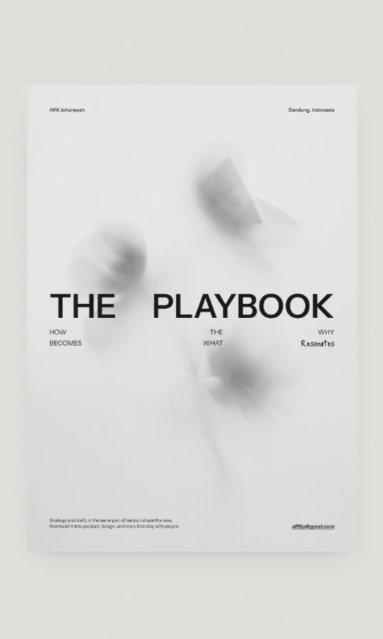
The playbook shows the plays. This is the room next to it, where each one gets rewatched, written up and argued about, and the locker room where that writing happens.
A playbook tells you how a play is supposed to go. It never tells you how it actually went. For that, every team has the same ritual after the final buzzer: you sit down, rewatch the tape, and talk about what worked, what broke, and what you would run differently next time.
My portfolio is The Playbook, a book of the work. But a book is finished by design. It can't hold the thinking that keeps happening after a project ships, the side projects that never make it into a case study, or an opinion I can't stop having. So the site got a second room: Post-Game Review, where the plays get rewatched and written up.
Names from the court
Once the book was called a playbook, the rest of the vocabulary arrived on its own. Not every review is the same kind of conversation, so each kind got a name from the court:
Film Session breaks down something I built, frame by frame: the problem, the old flow, the new one, the decisions in between.
Press Conference is for opinions, the part where you stand at the microphone and say what you actually think.
Overtime is fiction and stories, the extra period nobody planned for.
And the Locker Room is where all of it gets written. Readers never see it, the same way fans never see the whiteboard at half-time.
It is a small joke that turned out to be useful. Every time I start writing, the category already tells me what kind of piece it is supposed to be.
The same house, a different room
The first rule was that the reviews should never feel like a blog bolted onto a portfolio. So they wear the book's clothes: my name top left, the clock in Bandung top right, a rail down the left with its actions at the foot, the same grain on the same ground. The line under my name changes from A Portfolio to A Post-Game Review, and that is how you know you have walked into another room.
Moving between them is a transition, not a page load. Leaving the book, its index and actions sink, the book drops away and shrinks, and the reviews open. Coming back plays it in reverse. It should feel like turning around in the same space, not like being sent to a different website.
An index you can walk around
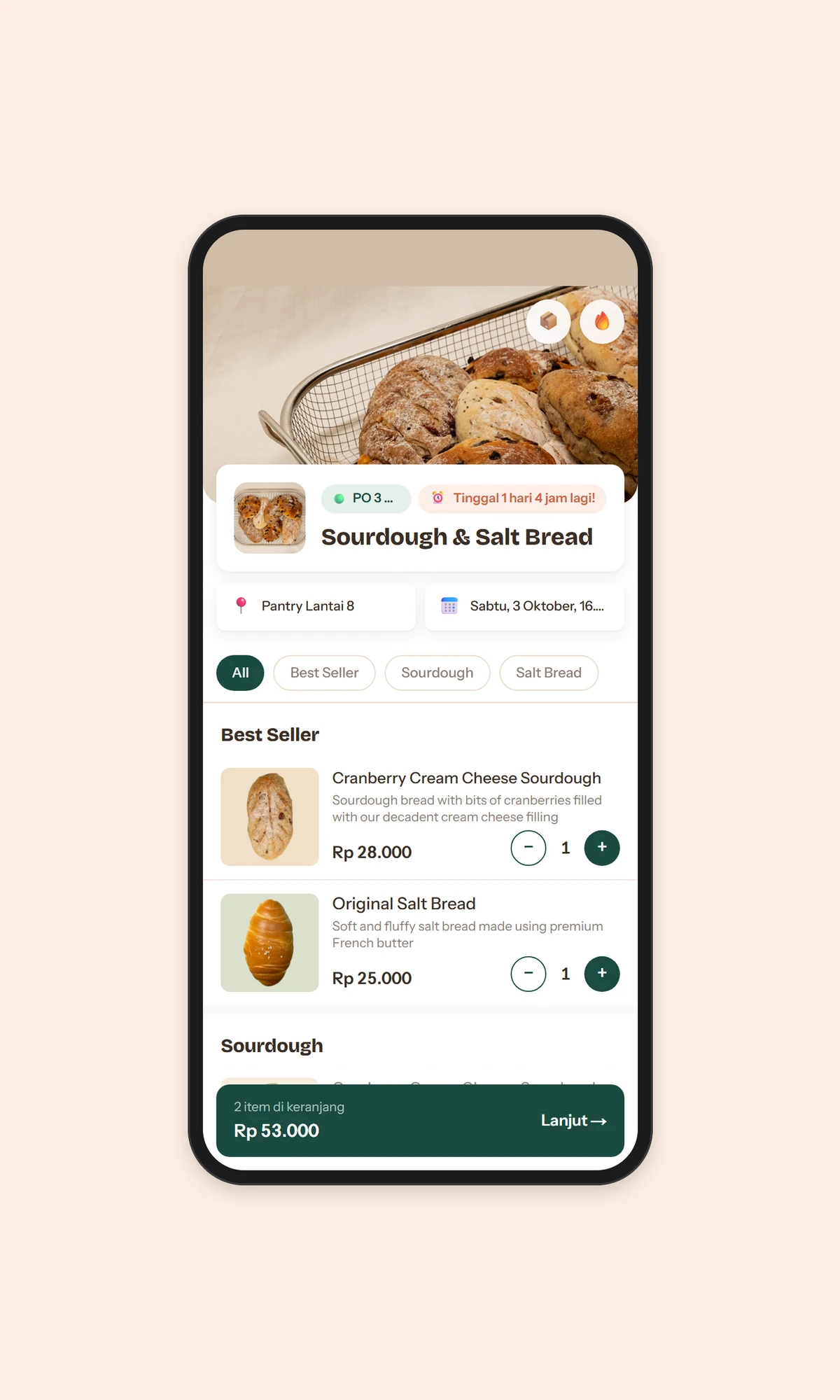
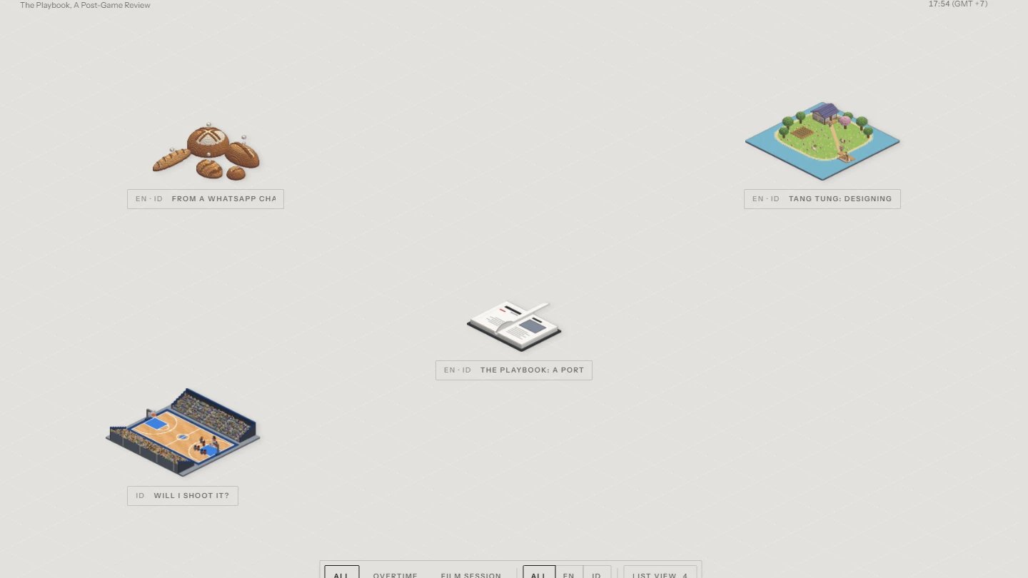
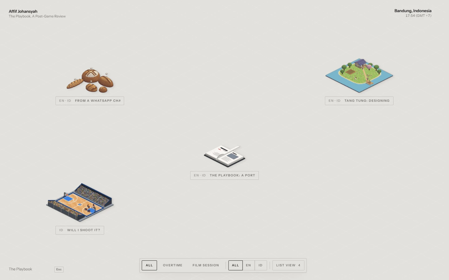
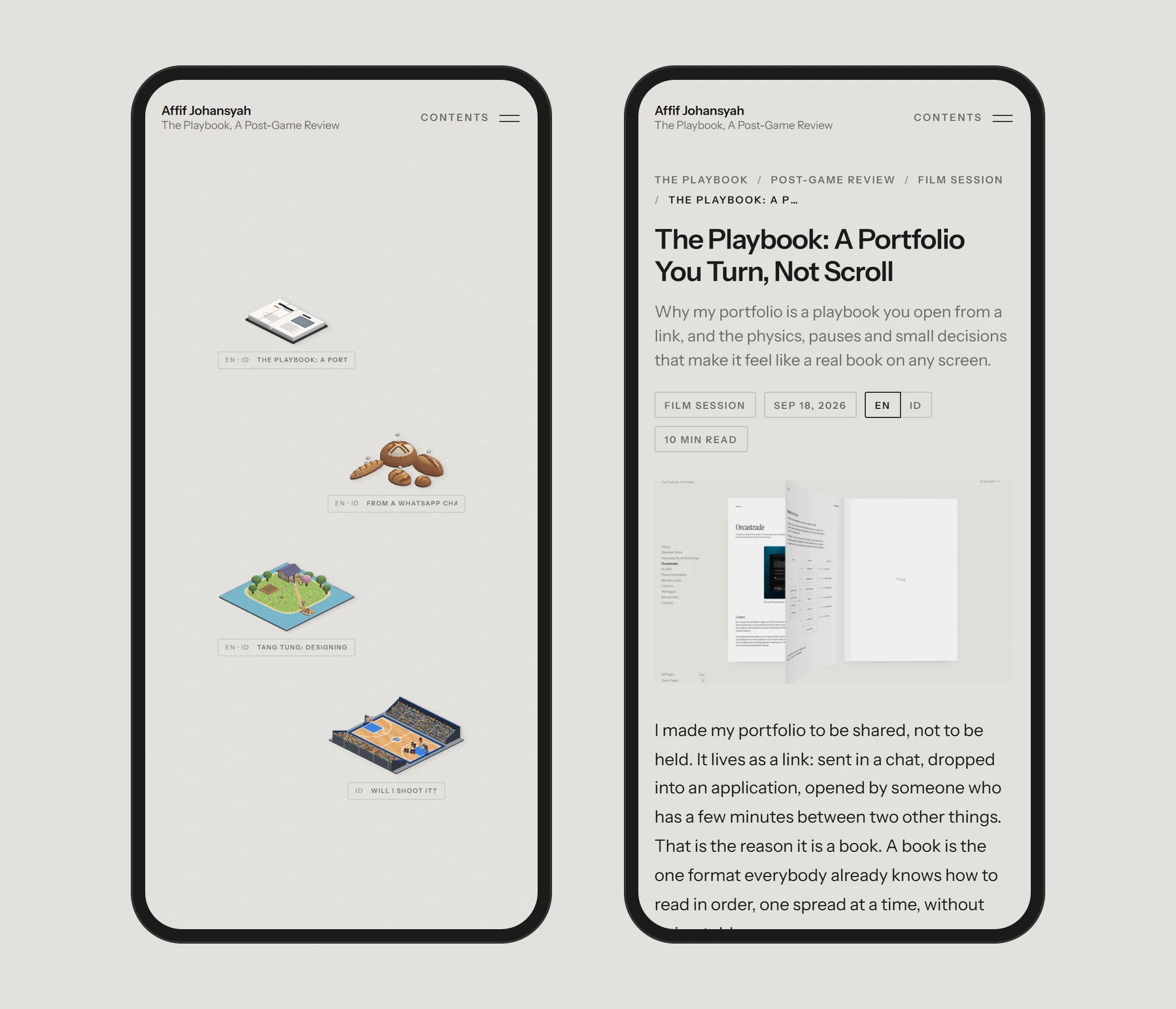
Most blog indexes are a column of cards. Here, the index is a floor. Each review is a cut-out, a small object that stands for the piece: a loaf of bread for a bakery ordering flow, an island for a game, a court for a story about a shot, a book for The Playbook. They stand on an isometric floor, and you can drag it, flick it and let it glide.
It behaves like something with weight:
The floor moves with your hand and glides when you let go, then eases back when you push past its edges, like a rubber band rather than a wall.
Every cut-out hangs on its own spring, with its own mass, so a quick drag makes them swing a little, each in its own time. Like a row of jerseys on hooks when someone slams the locker door.
A cut-out leans slightly toward your pointer as you pass over it.
Cut-outs keep the size they had in their picture, so a small object stays small beside a large one. A loaf is not the size of a stadium.
The floor itself is quiet: a faint grid, a slow wave, and a ripple wherever you touch it. It is the same field that sits behind the book, laid flat so the objects have somewhere to stand.
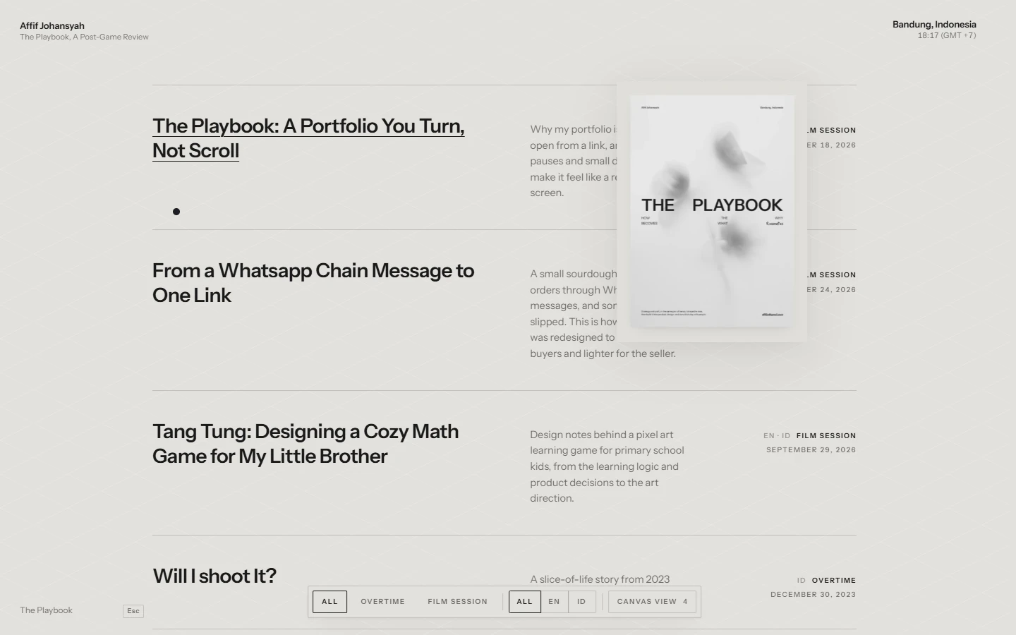
If you want to read rather than wander, List View turns the floor into rows: title, a one-line synopsis, category and date. As you move down the list, the review's portrait follows your pointer along the right-hand side, leaning into the direction you move.
Filters that you can send
At the bottom sits a single bar: category (All, Overtime, Film Session, and the rest), language (All, EN, ID), and the switch between canvas and list. Changing a filter plays the same exit and entrance whichever control you touch.
The filter lives in the address. A link to "only Film Sessions, only in Indonesian" opens exactly that, so a filtered index can be shared as easily as a single review. A portfolio built to be shared should not have a single page that can't be.
A review that reads like the book
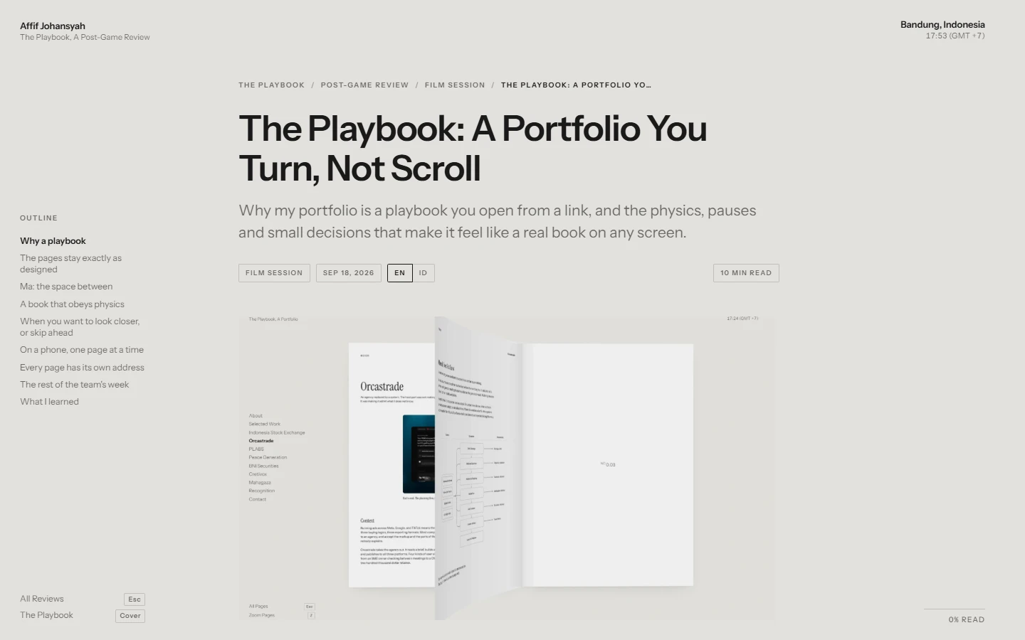
Opening a review keeps the house around it. The rail on the left becomes the outline of the piece, so you always know where you are and can jump to any section. Where the book shows its page number, the review shows how much of it you have read. At the top, a breadcrumb names the room you are in: The Playbook, Post-Game Review, the category, the review.
The text sits in a single column with generous line height, and every picture, video and table sits at that column's width. Under the review there is more to read, in the same style as the list view, so the next piece is one step away.
Two languages, one entry
I write in English and Indonesian, and most readers only want one of them. So a review can have a version in the other language, and the two are linked both ways.
On the index, a pair shows up as a single entry, labelled EN · ID, not as two near-duplicates side by side. Narrow the index to one language and you get that language's version. On the review, an EN | ID switch sits beside the date. And the translation is never offered as "read next" under its own original, because nobody finishes an article and wants to read it again in another language.
The Locker Room
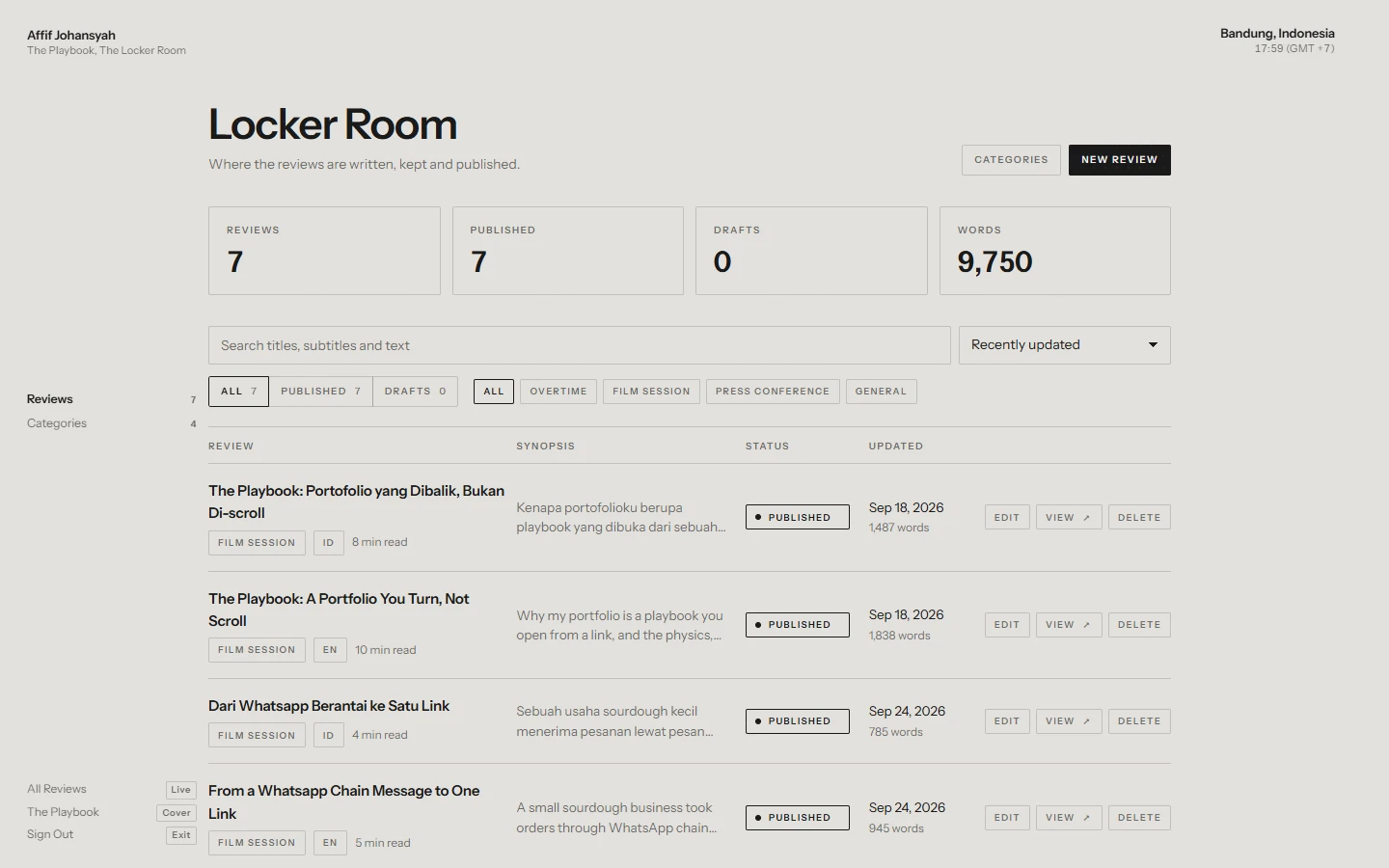
Every team needs a room the fans never see. The Locker Room is where reviews are written, kept and published, and it is built from the same parts as the rest of the site, so it reads as another room in the same house rather than a separate admin tool.
It opens on the squad sheet: how many reviews there are, how many are published or still drafts, and how many words in total. Below that sits every review with its category, language, status and word count, with search and filters, and the actions to edit, view or remove.
Writing in the column it will be read in
The editor's writing column is exactly as wide as the published one, and it says so at the top: 760px, the published column. What I see while writing is where the lines will break when it is read. No more writing something that looks fine in the editor and wraps badly on the page.
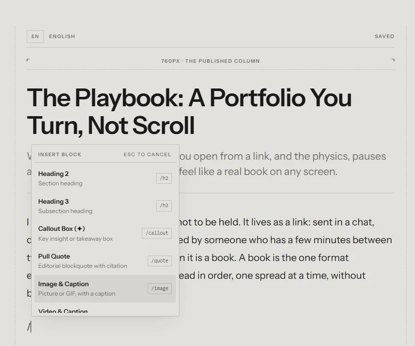
Everything the reader can show, the editor can write, from one menu. Typing `/` or pressing `+` opens the same list: headings, a callout, a pull quote, an image or a GIF with a caption, a video, a YouTube link, code, a divider, lists and tables. A few decisions made that menu worth trusting:
Pictures keep moving. A GIF stays animated as a cover, a cut-out or a picture in the text.
YouTube plays in our own player. Play, pause and a progress bar, nothing of YouTube's around it, so an embedded video looks like it belongs to the page.
Tables keep their shape. The column widths I drag in the editor are the widths the reader sees.
The bar keeps score. An SEO check, the word count and the reading time sit at the top while I write, like a scoreboard that is always on.
Both languages, side by side
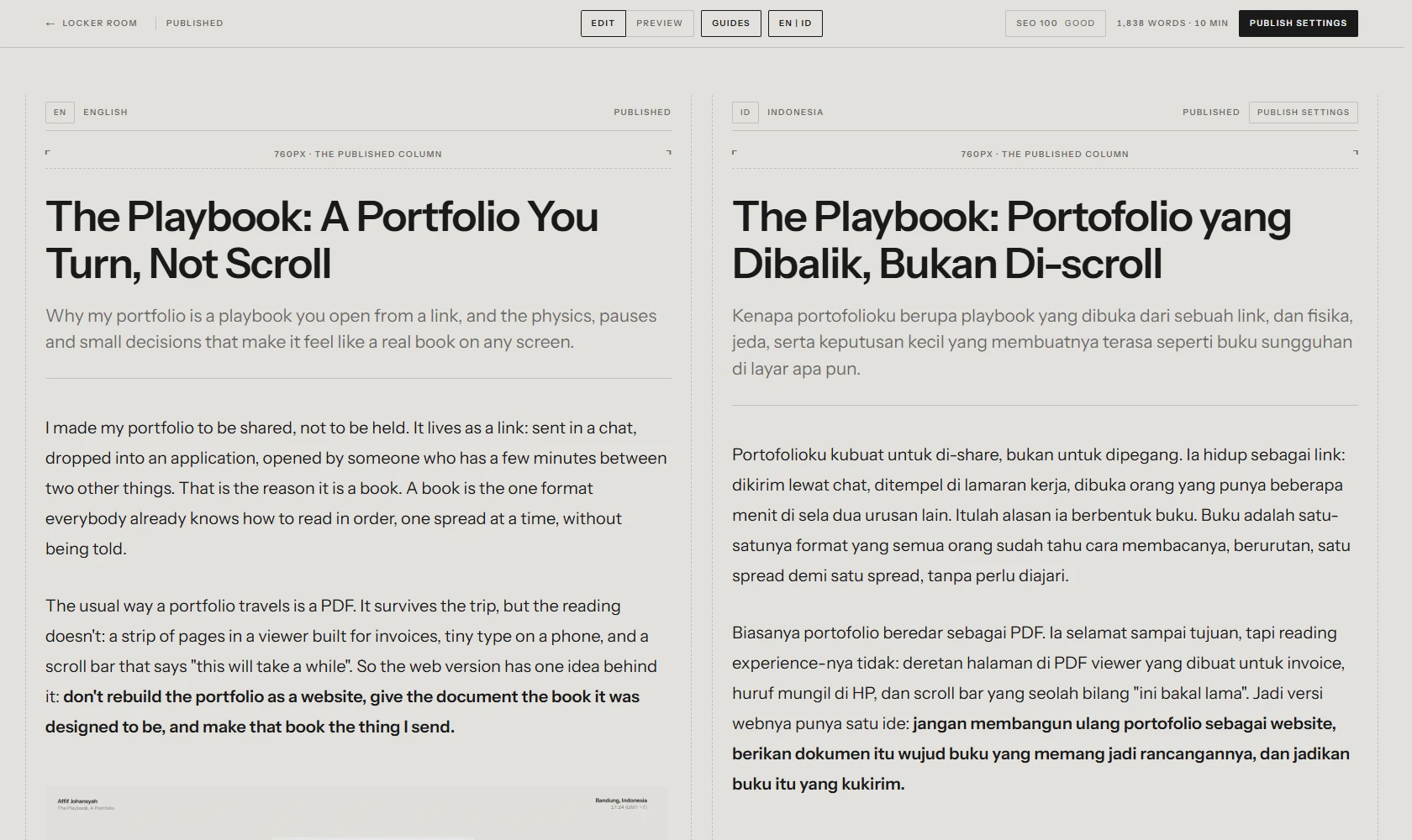
Writing a review twice is the tedious part, so on a wide screen the editor holds both versions in two columns, English on the left, Indonesian on the right, each saving itself. I can write a paragraph in one and translate it in the other while the thought is still warm.
A review with no translation yet shows an empty column, and the translation is only created when I type the first word into it. Opening the page never leaves an empty draft behind. A new translation shares the pictures, category and tags with its original, and starts with an empty page, because a translation that starts as a copy tends to stay half-translated.
What I learned
A playbook is only half the story. The other half is what you say after the game, when you have seen the tape. Building the Post-Game Review was mostly about keeping it in the same house as the book: the same chrome, the same quiet ground, the same care with motion, so reading a review feels like turning around in the room you were already in.
And the vocabulary did more work than I expected. Once the book was a playbook, every new part already had a name and a job. The book is the plays. The reviews are the tape. The Locker Room is where the work gets done.
Relevant reviews
- The Playbook: A Portfolio You Turn, Not ScrollWhy my portfolio is a playbook you open from a link, and the physics, pauses and small decisions that make it feel like a real book on any screen.EN · IDFilm SessionSeptember 18, 2026
- Tang Tung: Designing a Cozy Math Game for My Little BrotherDesign notes behind a pixel art learning game for primary school kids, from the learning logic and product decisions to the art direction.EN · IDFilm SessionSeptember 29, 2026
- From a Whatsapp Chain Message to One LinkA small sourdough business took orders through WhatsApp chain messages, and something always slipped. This is how the order flow was redesigned to be faster for buyers and lighter for the seller.EN · IDFilm SessionSeptember 24, 2026