From Paper Journal to the Crew's Phone
Design notes on a delivery and billing app for a water refill business, built for people who never asked for an app.
Every day, the crew on each delivery truck writes down where they went in a paper journal. Customer, number of gallons, cash or credit. Every few days, the owner sits down and types all of it into a spreadsheet. A lot of rows a day, often more than a week of them at once, in a session that takes hours.
Only after that do the numbers exist. Daily sales, the crew's bonus, who still owes money, the monthly invoices. Until the next typing session, the business runs on numbers that can be more than a week old.
When I asked the owner what hurt most, I expected the typing. It wasn't. It was not knowing, for sure, which customers had paid and which hadn't. The typing was just the reason.
These are the design notes behind the app I built to replace that journal. Most of the work was not screens. It was deciding where every number should come from.
What the spreadsheet already knew
The brief I received was a generic feature list for a water refill depot: brands, paid or unpaid per transaction, daily profit. The business's own spreadsheet, kept for years, told a different story.
The price is attached to the customer, not the transaction. Two customers on the same street can pay different prices for the same gallon. Cash or credit is also a property of the customer. Credit customers are billed monthly, with a printed invoice and a receipt. None of that was in the brief, and the monthly bill turned out to be the most important feature.
Reading one month of data said more than the brief did: thousands of delivery rows, hundreds of customers, and only a handful of rows with a receipt number written down. A spreadsheet formula is a business rule that has already been tested by years of use. So I started from the data, and confirmed every gap with the owner before locking anything.
The crew is the real user
The owner reads the reports. But the app only works if the crew writes into it, on the road, between houses, with one phone per truck. If recording a delivery is slower than writing on paper, they will wait until the end of the day, or stop.
So the delivery form had one target: four taps or fewer in the usual case.
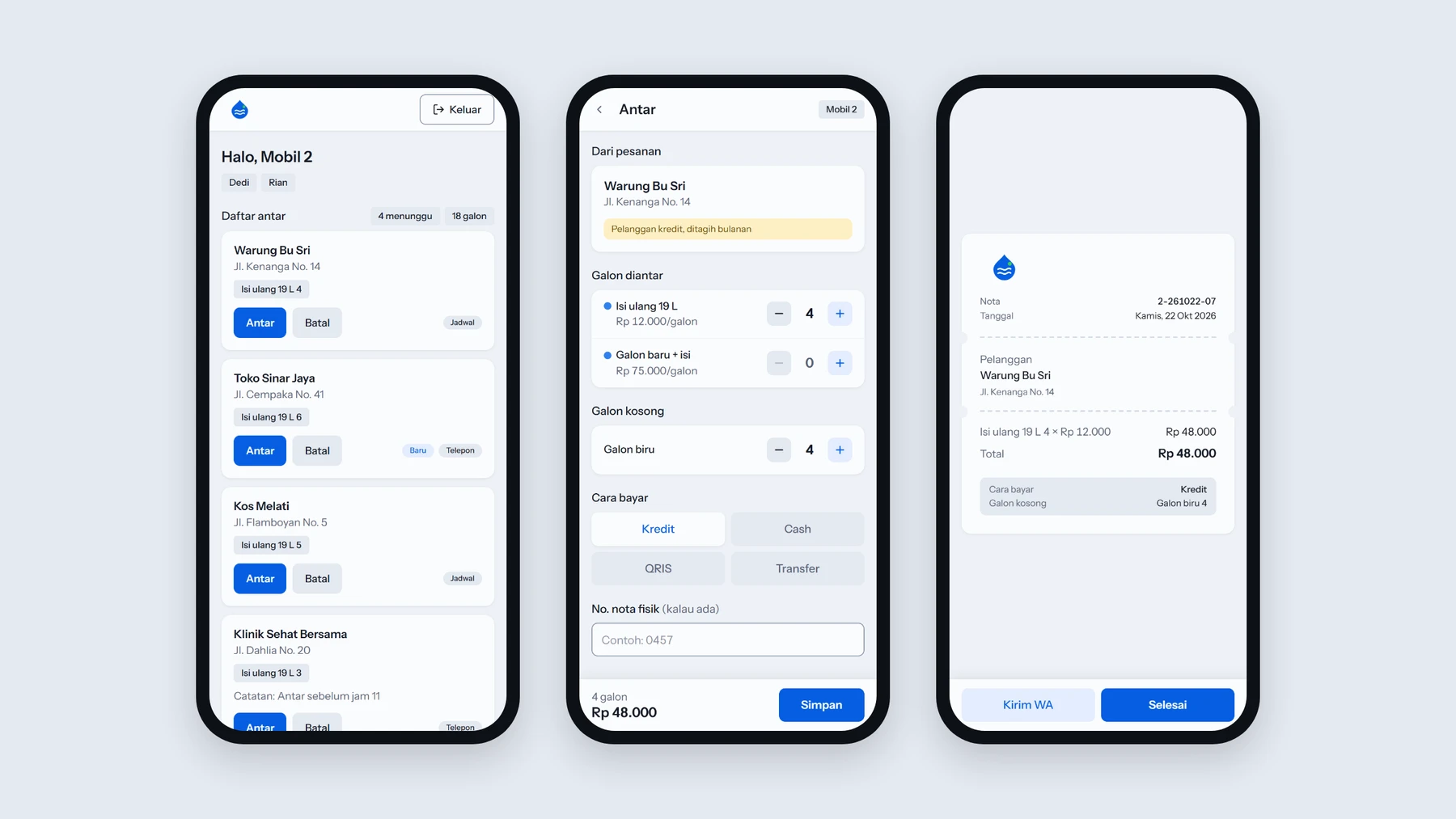
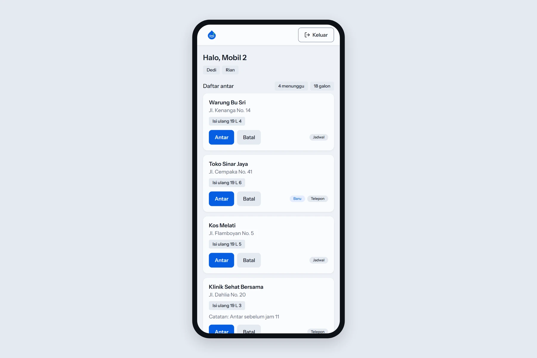
The list comes first. The crew opens the app to today's delivery list: customers on a fixed weekly schedule plus phone orders the owner added. Tapping an order opens the form with the customer, product and quantity already filled in.
Prices are never typed. The crew never sees a price field. The price comes from the customer, the same way the spreadsheet looked it up. Cash or credit also comes from the customer, and can be changed when someone pays on the spot.
Empty gallons default to the delivery. Gallons are swapped by brand, so the form assumes the same number of empties comes back. The crew only changes it when that's not true.
One login per truck, not per person. A fixed username and a six-digit PIN. Crews change, the truck doesn't.
The receipt goes out by WhatsApp. Every delivery gets a numbered digital receipt. The crew can send it to the customer with one tap. Printing stays on the owner's computer.
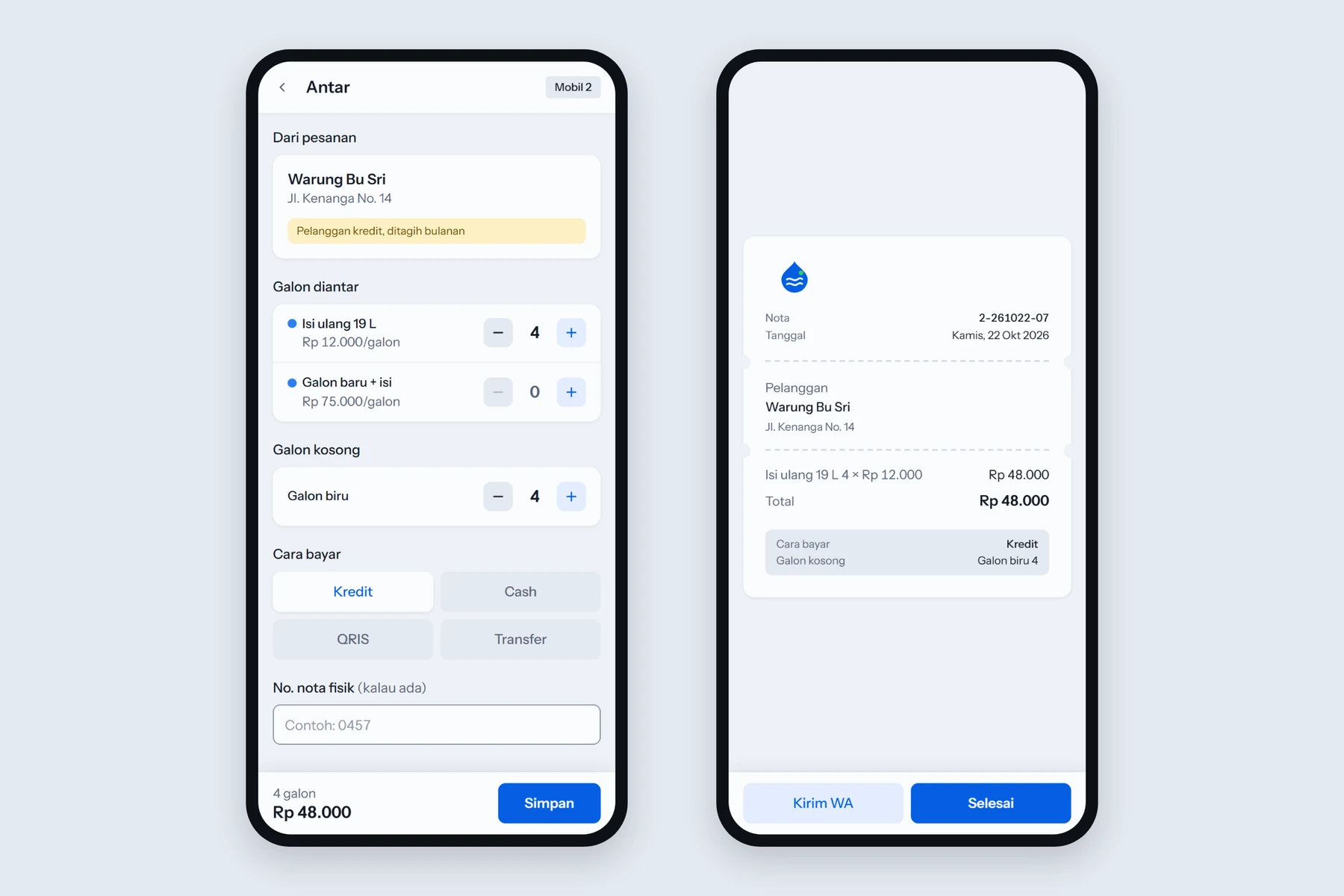
The first sample of these screens was built on a simple assumption: for people who aren't comfortable with technology, bigger is easier. Large text, large buttons, thick lines. The owner said it looked messy, and they were right. When everything shouts, nothing stands out.
The fix was to separate how big something looks from how big it is to touch. The minus and plus buttons look 32 pixels wide but respond to a 44-pixel area. Body text went down, important numbers stayed large. After a dozen rounds of small revisions, the rules became sharper than the original brief: no borders except on input fields, one spacing step, status chips shaped differently from info tags, and everyday Indonesian on the crew's screens while the owner's screens stay formal.
Money that can't be wrong
The second rule of the project was simple to say: the amount for each customer must always be right. That rule shaped most of the decisions the crew never sees.
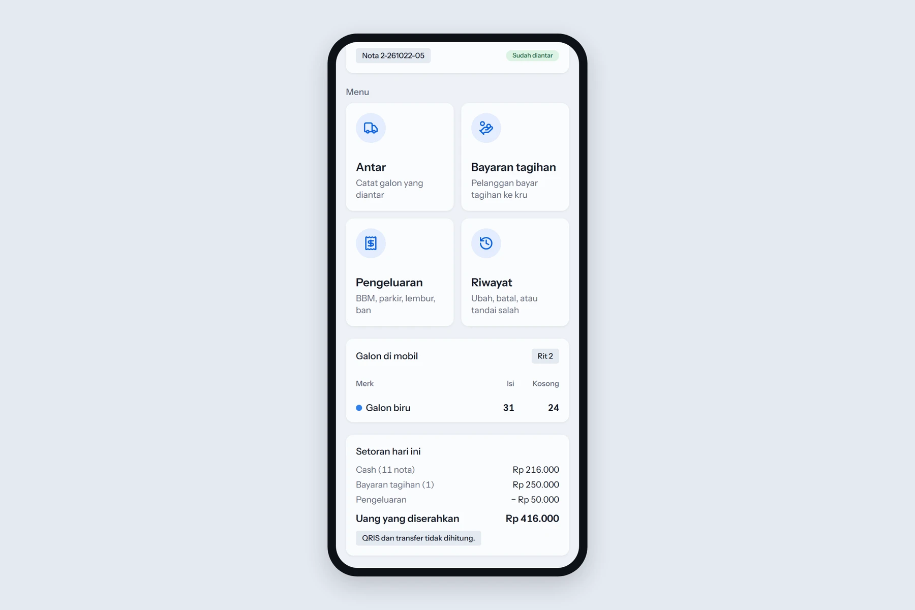
Balances are calculated, never typed. What a customer owes, how many gallons are in the warehouse, how much cash a truck should hand over, the crew bonus, the profit. All of it is calculated from the deliveries and payments. Nobody types a total, so nobody can mistype one.
Nothing is deleted. A delivery, payment or stock movement can only be cancelled, with a reason, and every change is logged. A cancelled receipt keeps its number forever.
Old prices stay old. Each delivery keeps the price it was sold at. Changing a customer's price tomorrow doesn't rewrite last month's invoice.
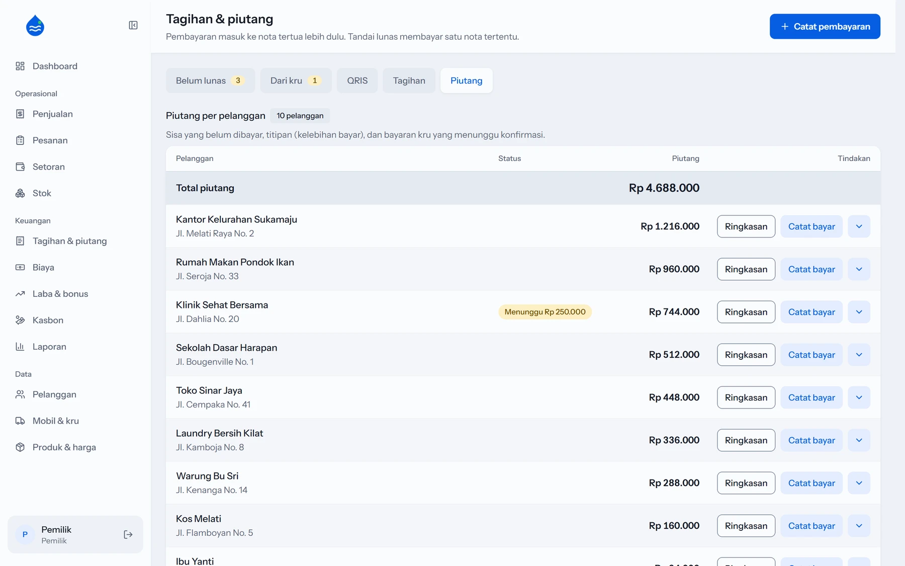
Payments clear the oldest debt first. That is how the owner already thought about it, so the app does the same.
The unload count is blind. When a truck comes home, whoever is at the warehouse counts the gallons without seeing what the system expects. The app keeps its own number next to the count. A difference is not quietly erased. It stays visible until the owner explains it.
Cash and transfers are separated. The truck's expected handover only counts cash in hand. Transfers and QR payments are checked by the owner against the bank report.
On the owner's side, the question that started the project, "who hasn't paid?", has its own screen.
A budget of zero
The business set one more hard rule: running the app should cost nothing per month. That ruled out more than I expected.
Automatic WhatsApp messages cost money, so there are none. Every message to a customer or crew is a ready-to-send WhatsApp link that a person taps to send. New orders reach the truck through a free phone notification and the delivery list refreshes on its own. Free databases don't include backups, so the app makes its own every night, encrypted, and every run restores that backup into a temporary database and compares it with the original, table by table. A backup that has never been restored is only a hope.
Before the first day
Before calling it done, I wrote a pre-mortem. Imagine that three months later the business is back on paper. Why?
The crew decides the form is slower than paper and records everything at the end of the day.
The opening balances don't match the old spreadsheet, and the owner stops trusting the numbers.
Cash comes up short with no trail.
Stock never matches, so everyone ignores it.
A weak signal or a double tap saves the same delivery twice.
Every item on that list is a design decision in this article. The four-tap form. An import that checks its own totals against the spreadsheet and cancels itself if a single number differs. The daily handover with a visible difference. The blind count. Every save carries a one-time key, and a matching delivery within ten minutes asks "already recorded?".
None of these are features anyone asked for. They are the reasons a business would go back to paper, turned into rules.
Relevant reviews
- From a Whatsapp Chain Message to One LinkA small sourdough business took orders through WhatsApp chain messages, and something always slipped. This is how the order flow was redesigned to be faster for buyers and lighter for the seller.EN · IDFilm SessionSeptember 24, 2026
- Tang Tung: Designing a Cozy Math Game for My Little BrotherDesign notes behind a pixel art learning game for primary school kids, from the learning logic and product decisions to the art direction.EN · IDFilm SessionSeptember 29, 2026
- Post-Game Review: What Happens After the Final BuzzerThe playbook shows the plays. This is the room next to it, where each one gets rewatched, written up and argued about, and the locker room where that writing happens.EN · IDFilm SessionSeptember 25, 2026